Webex client project (via Seattle School of Visual Concepts)
Objective:
Our group was tasked with designing a feature for Webex that helps answer this leading question:
How might we increase productivity and efficiency in real-time meetings, so that teams can meet less and do more?
Research background/key insights:
Real-time disruptions lead to significant meeting fatigue (ex. unmuted mics or sharing the wrong screen)
The bystander effect occurs virtually. Meeting participants may expect someone else to flag a disruption, causing it to go on for longer.
Non-verbal communication during meetings keeps participants engaged.
With these insights in mind, we sketched out several solutions before landing on the idea of a meeting alert system where participants can engage non-verbally to flag distractions and disruptions during meetings (unmuted mic, wrong screen shared, distracting background, etc.).
Early content explorations:
Onboarding content and feature enabling
Key takeaways:
Focused on how we can call out functionality of the new feature and make it enticing to click.
Questions arose around naming the feature appropriately. Initial code name was “nudge,” but that did not feel aligned to Webex voice principles.
At this early stage of exploration stage, “Heads Up” gained traction with the group as a conversational way of flagging disruptions.
Hover content and notifications
Key takeaways:
With the hover over content, I tried to strike a balance between describing the tool more conversationally vs. explicitly calling out the expected functionality.
Explored making the hover over content more about the participants vs. the alerts to emphasize the human element in the interaction
For notifications, I explored leading with questions to make the tone of the meeting alert less accusatory. After this round of explorations, the question became “do we need this many lines of content to fix the problem?”
More notifications and alert labels
Key takeaways:
Explored more explicit notifications with one line of text. For this “unmuted mic” scenario, I also explored a dynamic counter to show how many people have sent the meeting alert to the disruptor.
A/B tested grouped and ungrouped alerts to gauge comprehension. Initial hypothesis was that, while the ungrouped alerts would require less clicks, the grouped alerts might reduce cognitive load.
Refinements after usability testing:
Clearer grouping of alert types
Key takeaways:
Participants preferred grouped alerts, but needed a clearer sense of next steps. I added headers to make the array more scannable and provide context about the interaction.
Instead of an “issue,” I wanted to drive home the idea of sending an alert to a person. I wanted to make it clear that this space is to alert people and solve problems, not just flagging an issue into the void.
Alert description refinements
Key takeaways:
Much like the alert labels, I refined the grouped alert descriptions to be less diagnostic and more human.
Longer, more conversational descriptions of the issues the sender is experiencing felt much clearer.
Initial hypothesis for these refinements is that they will require less mental translation and feel more inviting to click.
Notification tone refinements
Key takeaways:
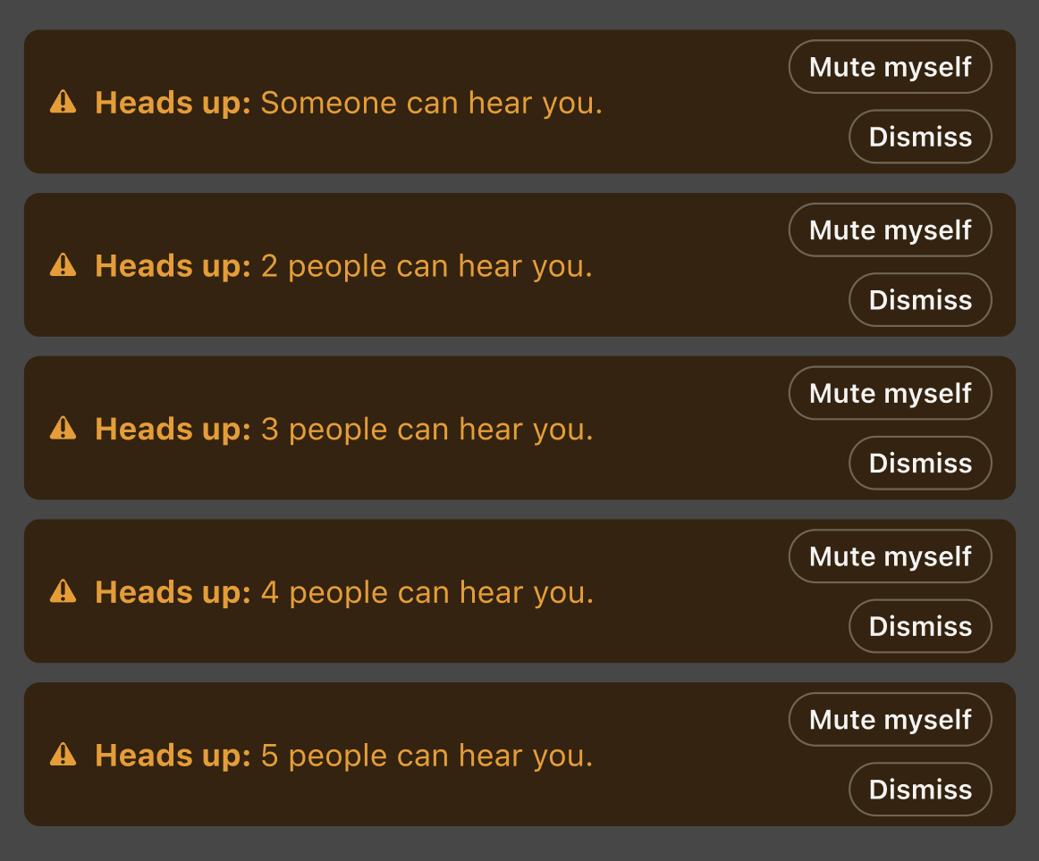
Participants were stressed to know the number of people sending them alerts. I pivoted to a softer alert tone that always began with “Heads up” that could scale to all alert scenarios.
The goal with this refinement was to give participants a quick, helpful path forward without causing additional stress. I wanted to strike a balance between the urgency of the notification and the ability to actually solve the problem at hand.
Describing the feature
Meeting alert tool (code name: Heads Up)
Key takeaways:
Closing the loop on naming the feature - testing showed that introducing the feature as “heads up” left participants wondering what it was meant to do.
“Heads up” as an in-meeting notification was well received and felt like a conversational spin on a potentially awkward situation, but my hypothesis is that keeping such a conversational name might reduce engagement.
I updated the tool description to be more explicit so that people would feel comfortable clicking on it without having to interpret colloquialisms.


